This blogpost contains research and development of the digipak to add it will also explain why we chose this option and design rather than the others. Written by Satria
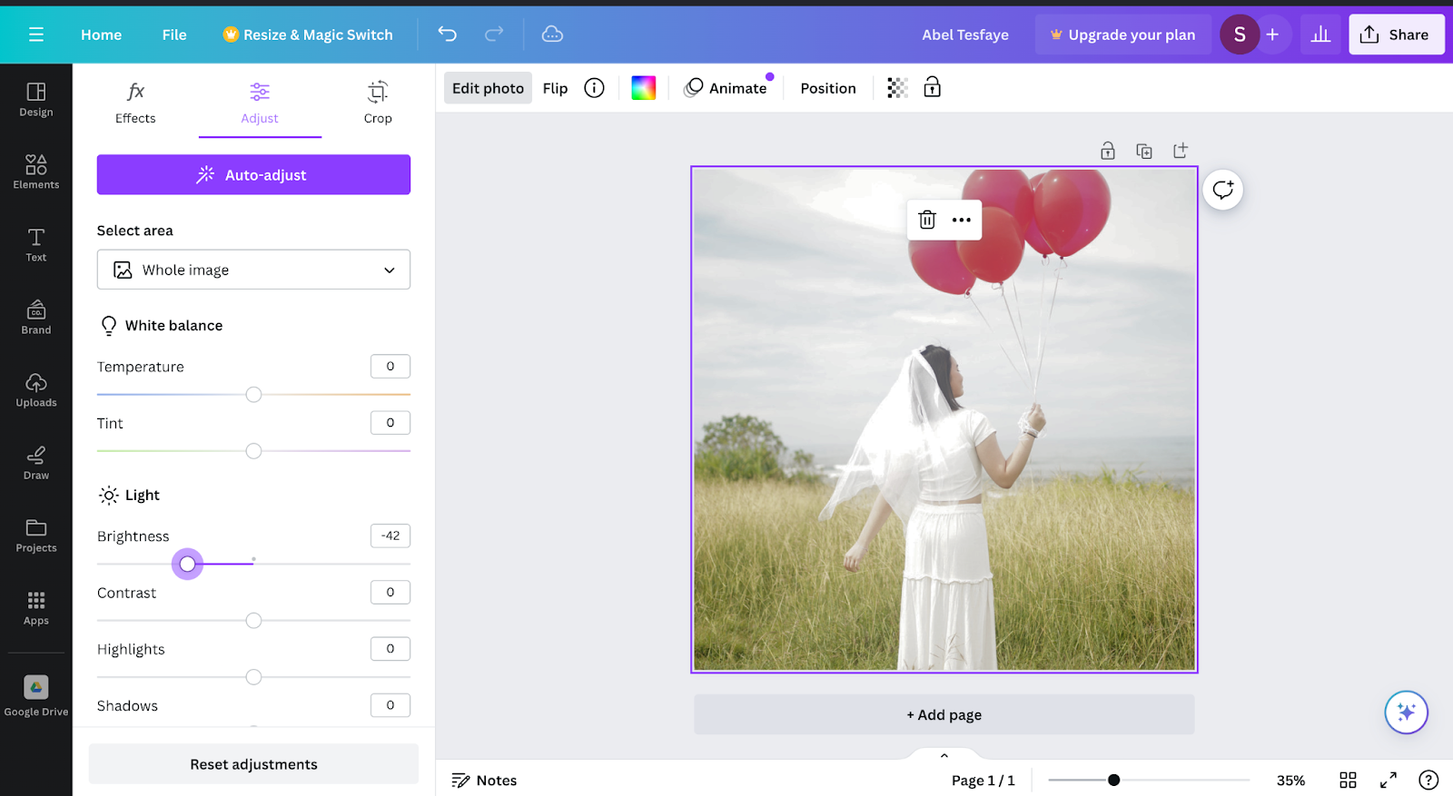
The images above are comparison between 2 same pictures with different filters the first picture above has a darker filter to make the image warmer by adding a slight blue filter on the other hand the second picture uses a bright filter to make everything look shiny. At the end I decided to use the first picture to as the front digipak cover, because with the warmer color it connotes more to the song which in this case have the song have a sad vibe. The warmer color fits more in the digipak due to the warmth it has and a darker brightness. Beside that it also easier to fit a font color on the first option, because it is not to bright while the second option the color is way to bright which may cause difficulties to read the caption.
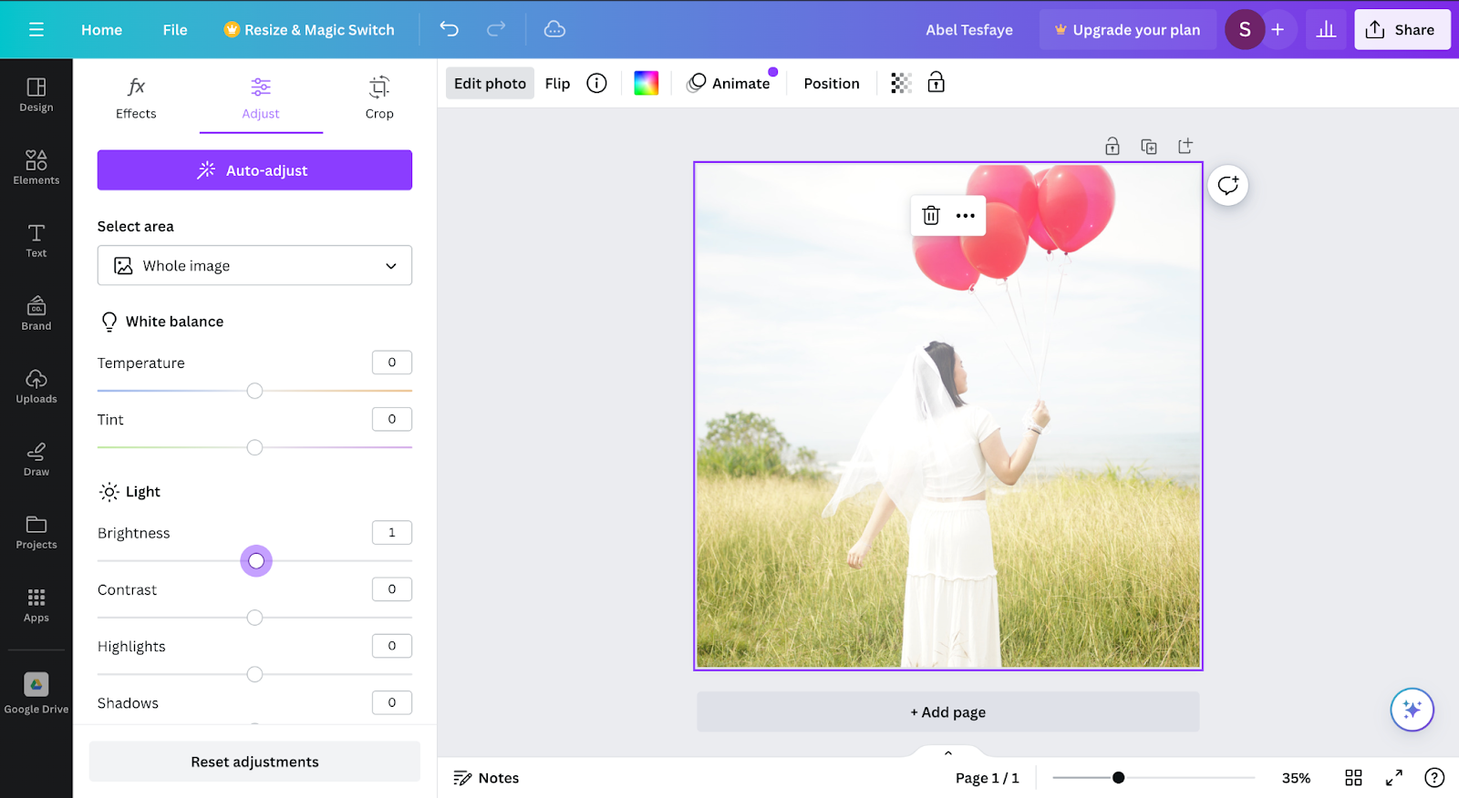
The images above are comparison between 2 same pictures with different filters the first picture above has a darker filter to make the image warmer by adding a slight blue filter on the other hand the second picture uses a bright filter to make everything look shiny. At the end I decided to use the first picture to as the front digipak cover, because with the warmer color it connotes more to the song which in this case have the song have a sad vibe. The warmer color fits more in the digipak due to the warmth it has and a darker brightness. Beside that it also easier to fit a font color on the first option, because it is not to bright while the second option the color is way to bright which may cause difficulties to read the caption.
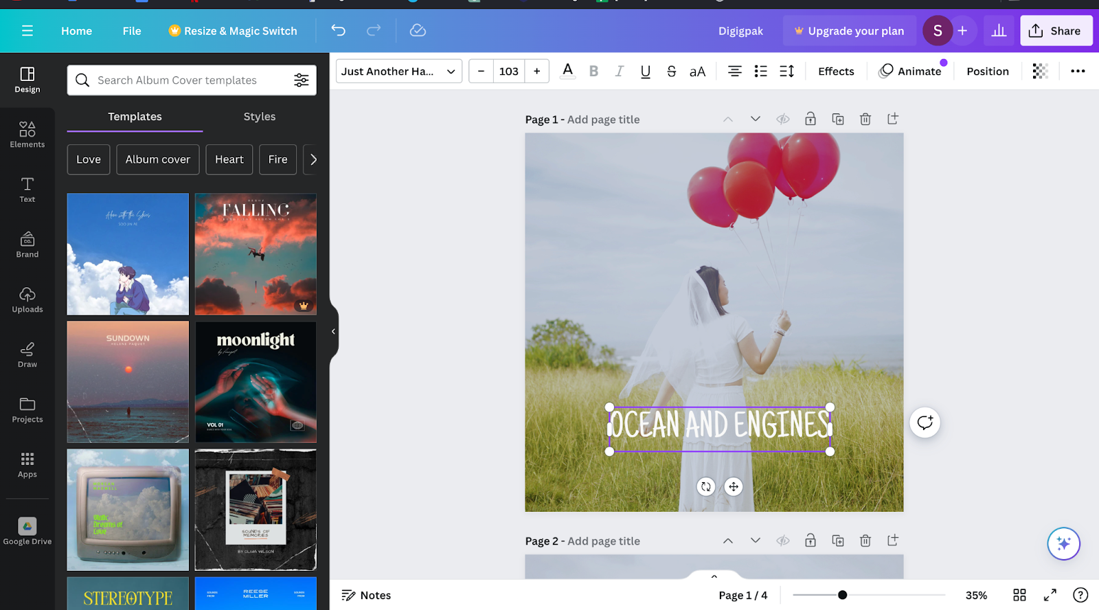
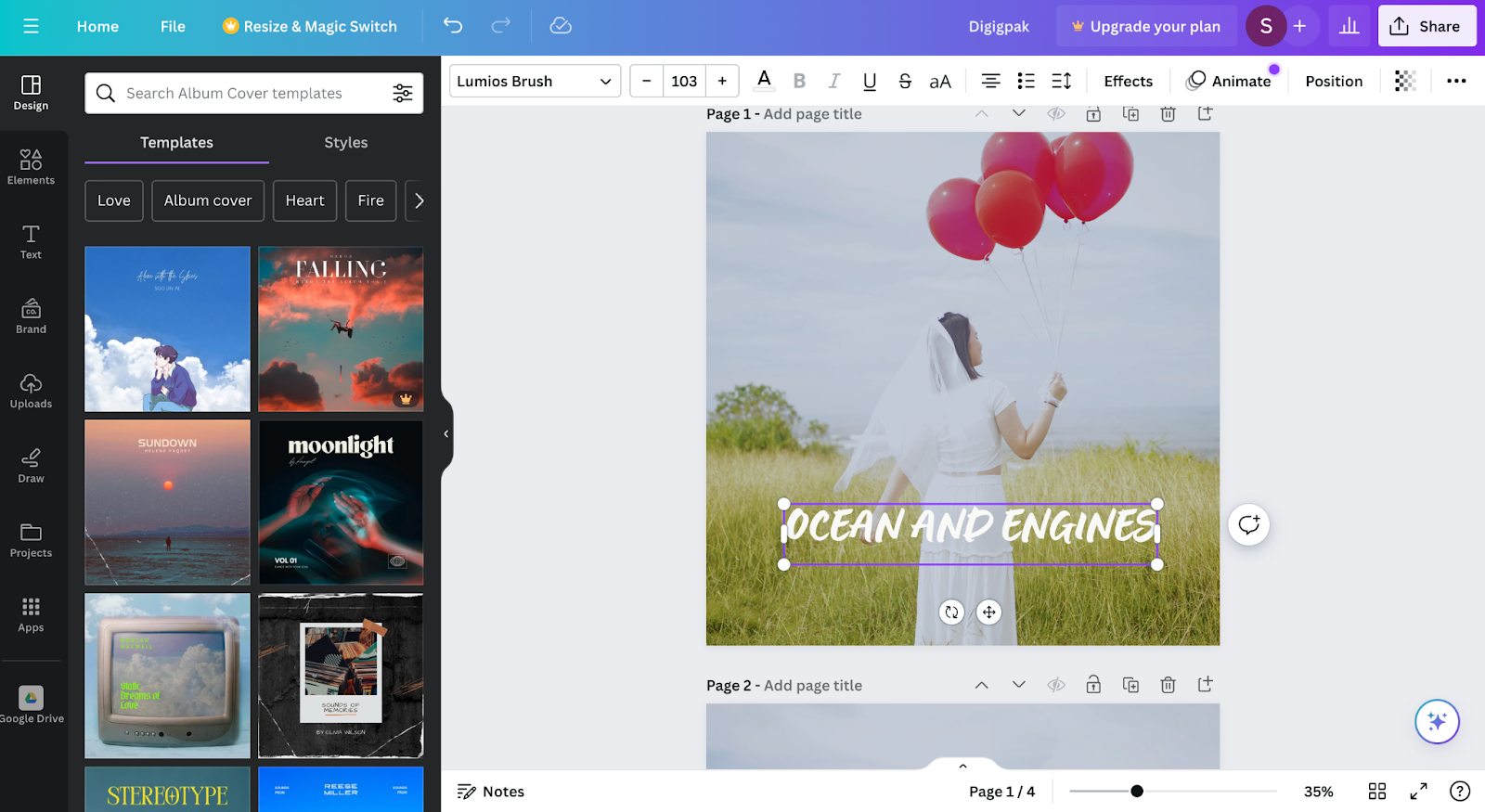
These two image above are comparison of fonts that we might use for our digipak album cover. The first picture has a font that is called "Just Another Hand" this font has a simple and compact design compare to the second picture with "Lumios Brush" font it has a more complex design and to add the first font its easier to read rather than the font in the second picture. We chose "Just Another Hand" for our
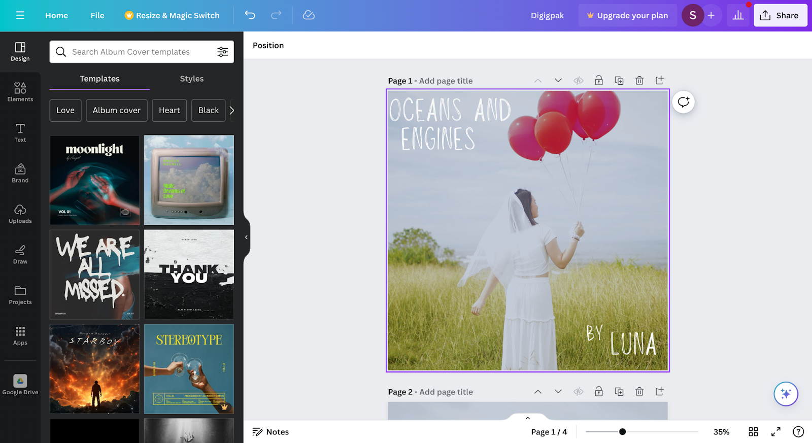
In the middle of the timeline I decided to change our font into Louiseville ll, I change to this font instead of the previous font because its is fit better to the background of the digipak and it also has a connotation that this font is handwritten by Luna. We the handwritten design of the font gives the vibe a bit more calming rather than the other are more leanign towards AI generated font, I want to make this digipak look like Luna's is creating it from scratch by herself with her own hand writing.
To finalise the design of the digipak i decided to use the Lousieville ll font to use for the final product of the digipak.
This section is wrriten by Theo
I revised the digipak again where I wanted to give more variety so here are some changes in the digipak post production that I made.

So first I changed the picture for the front cover.

And I decided to distort the text so the digipak wouldn't be so bland and ordinary
Self Reflection:
Constructing the digipak was very challenging for me and Satria as we both are clueless who have the make one in the end. So we trade ideas a lot until we debate a lot for the creation of digipak since we have a different ideas on how the digipak should be portrayed and at the end we manage to combine our ideas and finish the digipak


No comments:
Post a Comment