Labels

Component 3 - Post Production

This blog is written by me (Theo)

The main software that I used the Premiere Pro CC 2023 where I have been using this since I begin my editing career where I already familiar with the mechanism of this editing software. After each shot that I finished I always manage my files into folders so I have a neat and smooth work flow

Shown below is the overall timeline for the project


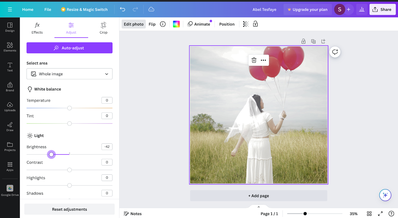
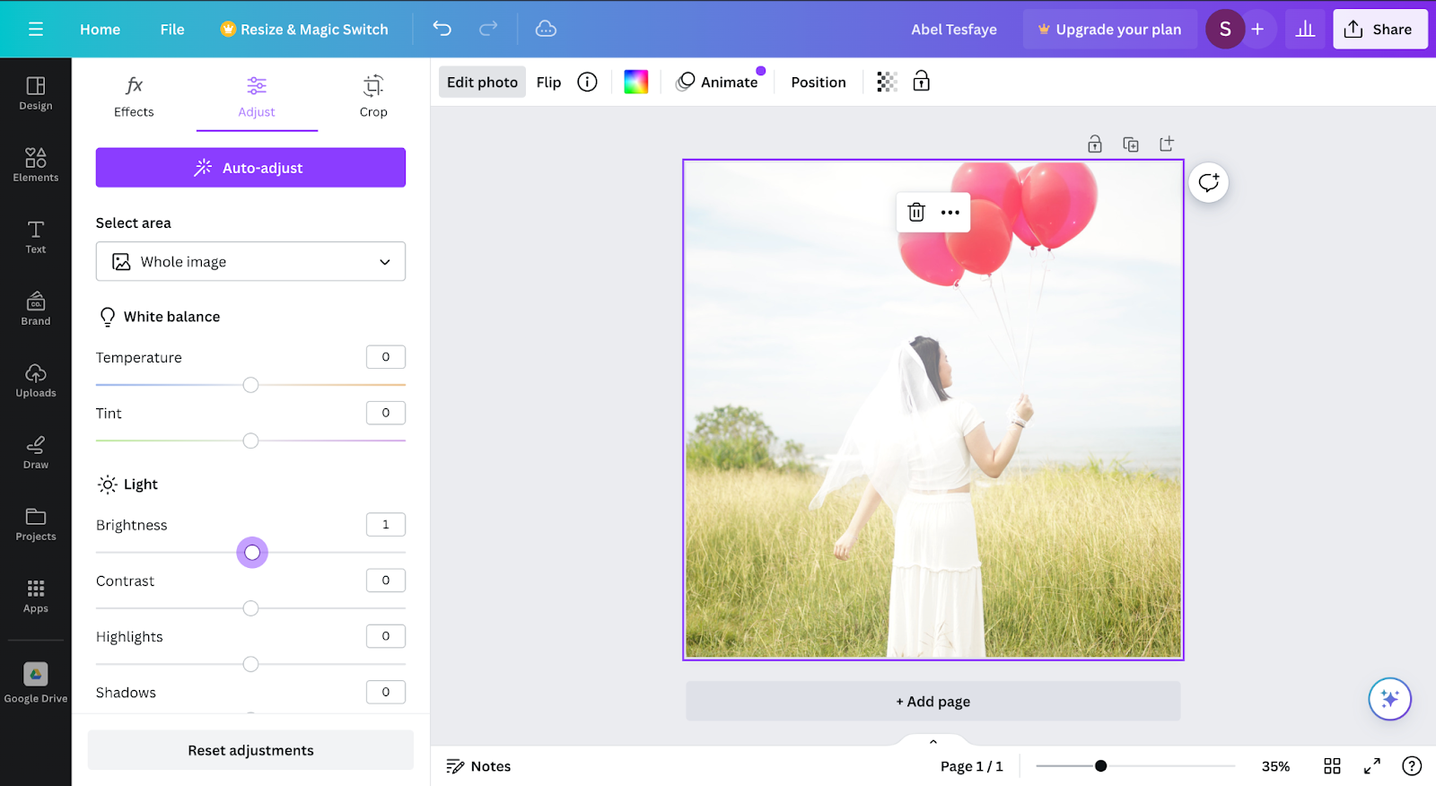
1. Colour Grading (Lumetri Color)

Colour grading is the most essential part of the music video editing where I wanted to make sure where the music video is likely to be visual appealing and spoil the audience. Colour Grading also important in driving the mood and the tone of the music video 


(Before color grading)
(After color grading)

2. Glowing Dreamy Effect

This is done by copying the layer below into the top and putting the Gausian blur effect on top and put luma key in other to get the glowing blooming effect


(Before Gloomy Effect)


(After Gloomy Effect)

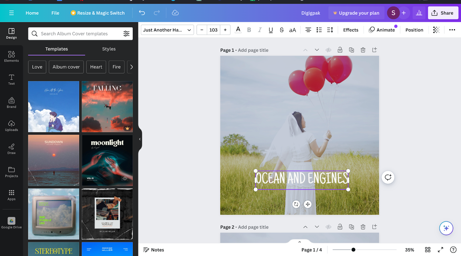
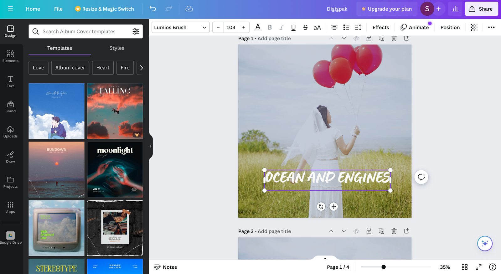
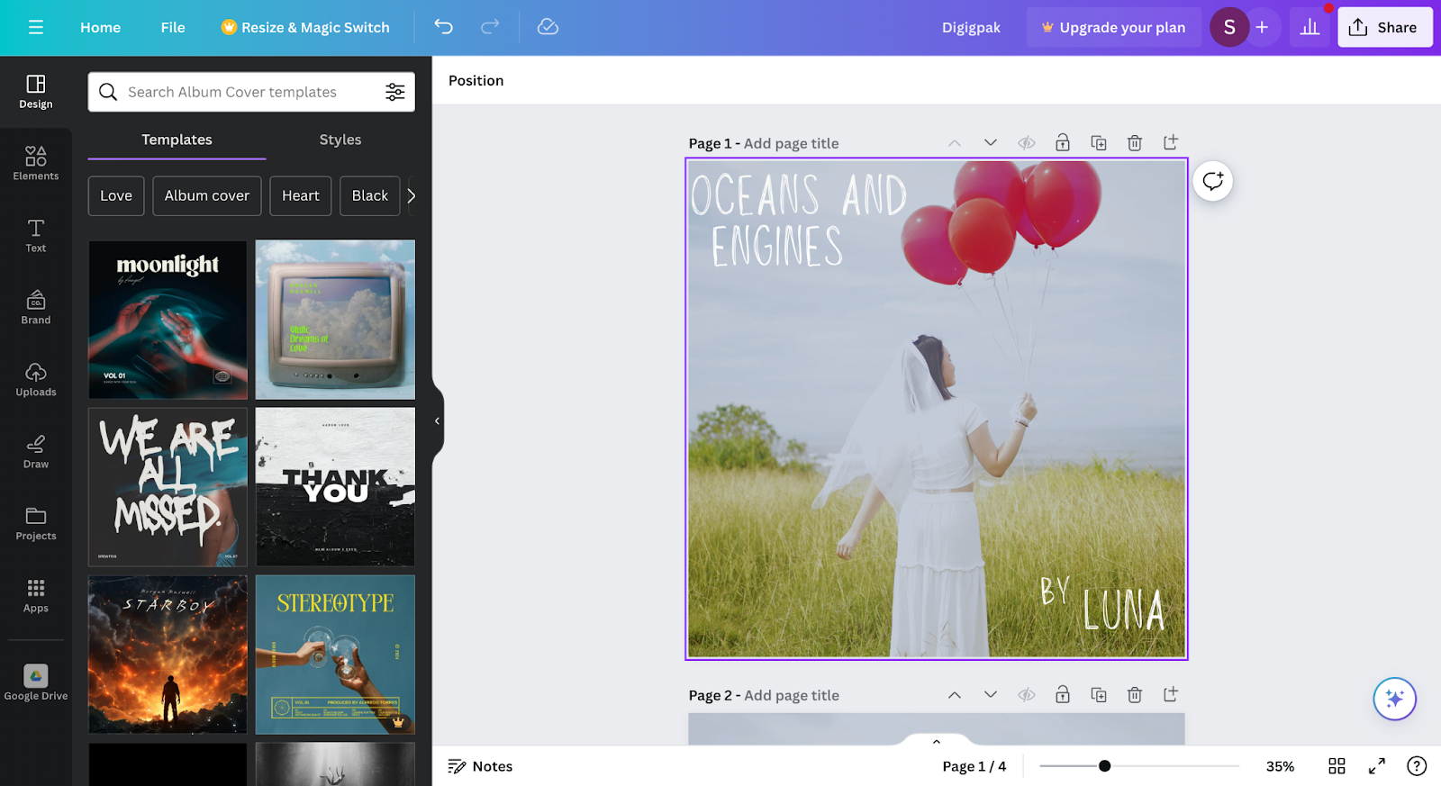
3. Music Video Title


4. Stabilizing
Since some scenes were quite shaky I need to edit the scenes to be more stable. I do this by doing some masking on the subject since the effect I used is wrap stabilizer. The masking is important for making sure the subject is not jellying.


5. Slow Motion effect
Since I wanted to put some slow motion effect I do this by reducing the speed and used frame sampling in order for more fluid slow motion


6. Key frame
I used keyframe technique to make the zoom in effect or zoom our effect. Different keyframe will represent different scale and if I want to make the zoom in effect hence each keyframe will increases the scale step by step and for zoom out will be the opposite. 


Reflection:

During the editing process, I faced many issues where my files disappeared or were corrupt. The editing software itself also crashed multiple times as I threw high-resolution 4k footage for it to process. However, through this editing process, I learned many new things. Editing techniques used in other videos don't always work in music videos, this forced me to do research and learn more techniques that would be useful in this project. Lastly, spending so much time colour grading allowed me to find a colour theme that I like, whilst still applying to the style and colour scheme we planned. In future projects, I would find more ways to further streamline the process of editing, since I spent so much time experimenting during the process of editing this music video. I would hope for future projects to be edited more efficiently. Overall, this post production process has taught me patience, whilst testing my ability to quickly learn new techniques.


Component 3 - Social Media Post Production

This Blog is written by Theo

Concert Post:

Concert post is really crucial for the social media page in other for the audience to be aware about the up coming concert by out artist.


Spotify Award:

Since the songs of our artist will be released in Spotify our artist will most likely get the infographic on how much the song of our artist has been played.


(before)


(After)

Grammy Award: 

This post is also important as a part of an appreciation for the audience


Personal Picture:

Personal pictures also contributes in building the brand identity for our artist where wanted our artist to be able to express herself like selfies just like the ordinary people do.


(Personal pictures that are given by our artist)
(Pictures taken by me (Theo))


Teaser:

To increase the awareness for the audience and fans it is crucially to make a teaser. The teaser that the team decided is the mood mv where this tells the mood of what's going to be the mood of the coming soon music video. Here is the link for the Mood Teaser.


Reflection:

Overall all these main section of the social media posts helps us achieved for increasing the artist awareness and identity that we wanted such as charming, humble, sweet, delightful and beginnings. We were having a big debate on how the artist should be portray in the beginning which turns out that the Instagram page is not really looking professional like artist in usual. Even the layout is not really going as planned I learn how to organize the Instagram feeds.


Component 3 - Digipack Post Production


This blogpost contains research and development of the digipak to add it will also explain why we chose this option and design rather than the others. Written by Satria


The images above are comparison between 2 same pictures with different filters the first picture above has a darker filter to make the image warmer by adding a slight blue filter on the other hand the second picture uses a bright filter to make everything look shiny. At the end I decided to use the first picture to as the front digipak cover, because with the warmer color it connotes more to the song which in this case have the song have a sad vibe. The warmer color fits more in the digipak due to the warmth it has and a darker brightness. Beside that it also easier to fit a font color on the first option, because it is not to bright while the second option the color is way to bright which may cause difficulties to read the caption.
These two image above are comparison of fonts that we might use for our digipak album cover. The first picture has a font that is called "Just Another Hand" this font has a simple and compact design compare to the second picture with "Lumios Brush" font it has a more complex design and to add the first font its easier to read rather than the font in the second picture. We chose "Just Another Hand" for our
In the middle of the timeline I decided to change our font into Louiseville ll, I change to this font instead of the previous font because its is fit better to the background of the digipak and it also has a connotation that this font is handwritten by Luna. We the handwritten design of the font gives the vibe a bit more calming rather than the other are more leanign towards AI generated font, I want to make this digipak look like Luna's is creating it from scratch by herself with her own hand writing.
To finalise the design of the digipak i decided to use the Lousieville ll font to use for the final product of the digipak.

This section is wrriten by Theo

I revised the digipak again where I wanted to give more variety so here are some changes in the digipak post production that I made.


So first I changed the picture for the front cover. 
And I decided to distort the text so the digipak wouldn't be so bland and ordinary

Self Reflection:
Constructing the digipak was very challenging for me and Satria as we both are clueless who have the make one in the end. So we trade ideas a lot until we debate a lot for the creation of digipak since we have a different ideas on how the digipak should be portrayed and at the end we manage to combine our ideas and finish the digipak


Glossary

Component 3 - Final Piece

 This Blog is written by me (Theo) Music Video: In case the video got any copyright issue here is the link to the music video Digipack: Fron...